Konstrukt Consulting
Konstrukt Consulting is a boutique consulting firm focused on media and entertainment technologies. They understand dynamic, disruptive innovation while respecting the structured, traditional, and timeless.
The Goal
A brand design and client-facing materials that Konstrukt Consulting could use to introduce themselves and communicate their services, expertise, and aesthetics.
My Role
Brand Design, Print Design, User Interface Design, Information Architecture, Web Development, Project Management
Discovery
I facilitated a series of workshops with Konstrukt’s founders. Through information-sharing exercises, I learned about their Los Angeles experience, inventive hobbies, quirky bicycle obsessions, and Art Deco aesthetic. Their target audience is the busy entertainment executive who needs straightforward, actionable solutions from authentic, reliable partners.
Solution
Logo
In the spirit of structure and systems, I drew inspiration from Mid-Century Modernism. The wordmark uses Eurostile Extended Bold, a paragon of minimalist typography designed by Aldo Novarese for Fonderia Nebiolo in 1962 that has been used successfully in wordmarks throughout the 20th Century. It defines a bold new world in which anything is possible.
Color Scheme
The color scheme is based on the overlapping colors resulting from the CMYK printing process but is intentionally removed from the directness of pure process colors. The Konstrukt color scheme is provocative, thoughtful, and carefully considered. The colors denote a sense of mastery in interrelating moving parts to create cohesive, systematic completeness.
Fonts
As aforementioned, the wordmark is Eurostile Extended Bold. The fonts for standard usage (print and web) are Mr. Eaves Modern / Bold, by Emigre Fonts, and Aktiv Grotesk / Italic / Bold by Dalton Maag. These fonts were chosen because they continue the narrative of the wordmark without competing with it. They are reputable and professional, yet accessible and affordable.
Additional Graphics
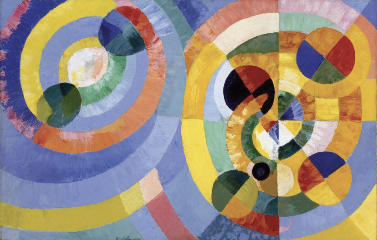
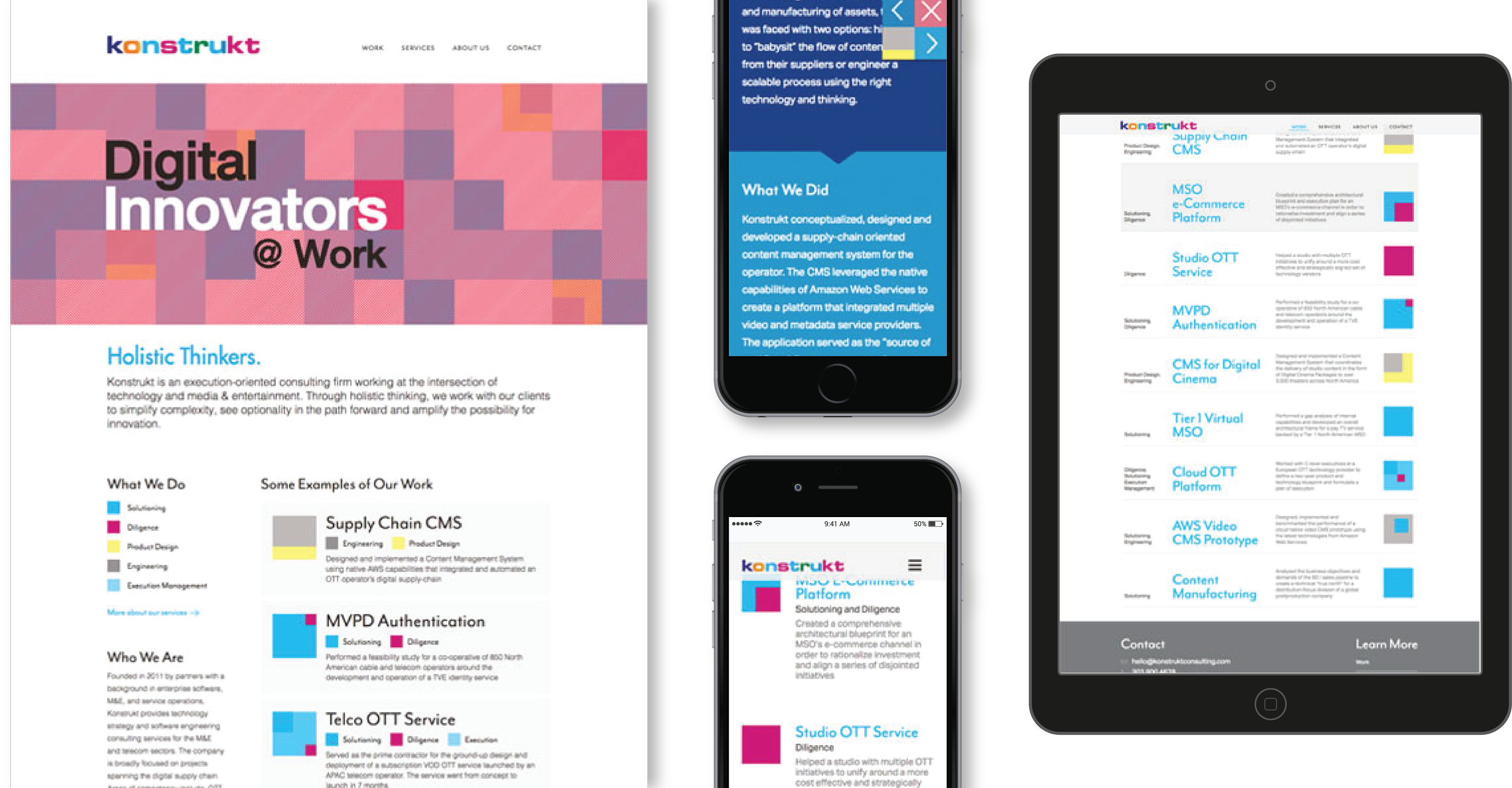
For the illustrative nature of the website, I drew inspiration from Swiss Design. I combined this typographic style with the bright, bold colors and shapes of Orphic Cubism.
Color codes were applied to help the reader identify Konstrukt’s services. These color codes were then combined into cubical icons in case studies. The iconography conveyed that each case study was a unique combination of services, like jigsaw puzzles, addressing problems with a holistic and cross-functional approach.
Collaterals/Templates
I worked with Konstrukt founder Tim Aron to architect a website and content that, just like the visual style and brand, was purposeful, intentional, and minimalist.
Final Deliverables
The final deliverables included:
The logo wordmark in four formats (CMYK high resolution, RGB web resolution, black-and-white, and grayscale) and a series of file types
A set of additional graphics
Business card designs and 100 physical business cards
A complete live website
A brand toolkit that Konstrukt can revisit any time they are making decisions that would influence or be influenced by the brand


